Background:
I’m using Scrivener 1.x on Windows and Sigil 0.7.x. Sigil is free. Scrivener is not, but it’s well the worth the money, in my opinion. If your time is worth anything, it’s worth moving up to Scrivener.To complete this guide, you should have a basic understanding of html or be willing to learn. If that’s not you, then you should skip all this and hire a formatter.
The Windows version of Scrivener doesn’t quite have all the bells and whistles that the Mac version has. For instance, in the Mac version, you can just point to where you have your front matter stored. In Windows, we need to drag it into place. Mac users may find some value here, but this is written for Windows users.
Introduction:
You’ve written your masterpiece, edited it to within an inch of its life, and are ready to send your file out into the big, bright world (or cold, cruel world, for the cynical types). Depending on where you want to send it, you’ll probably need 2 files: a Word file for Smashwords and potentially for your POD printer (although if you want to go hardcore, you’ll send the POD folks a pdf made from InDesign; that’s what I did with the paper version of Derrick the Dog), and an epub for just about everybody else (even Amazon’s KDP will accept a good epub, so you don’t need to bother with a mobi file; I’ve not yet seen any problems with their conversion). I’m not going to talk about Word here. There are plenty of good templates out there and Smashwords has its own easy-to-follow guide. I’m going to talk about producing a fair- to good-looking epub with a minimum amount of time and effort. For this tutorial, I’m going to use my novelette Repetition.Scrivener setup:
Here’s the setup of Repetition:
You can arrange your files and folders in any way that makes sense to you. I chose to separate out my front and back matter from the rest of the text to make it easier for me to see.
You’ll note down under Research, I have a separate front/back matter folder. This is where I can keep track of the different versions of my copyright page and, if there was going to be a print version, my newsletter page (I use different links/QR codes depending on the format so I know where users come from). Then, I just drag the one I want up into the story when I’m ready to compile and drag the other out.
I also keep an orphaned scenes folder. For the most part, I tend to write linearly, but sometimes I have a really strong idea for a scene and want to get it down. I can stick it in here and then worry about where to put it later. Alternately, if I don’t like a scene, I’ll stick the older version here and rewrite (if it’s just an edit, I use the snapshots feature). That way, it’s always accessible to me later on. In the case of Repetition, I had the idea to put a couple of these scenes that didn’t make the final cut at the end of the book.
Besides all that, I have the standard places to store my character and location sheets. I didn’t do much with those here, as it’s pretty short. I make more extensive use of the feature in longer works with more characters to help ensure I don’t forget details and have to go hunting through the text.
The point is, you can set this up in whatever way makes the most sense to you. It won’t matter once we get into the business of compiling for epub, as I’m about to show.
One final note, I don’t get fancy with fonts, sizes, alignment, etc. in Scrivener. I make sure my text is bolded or italicized where I want it, but that’s about it.
The compile screen:
Contents:
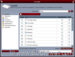
Here’s the first compile screen for an epub. Notice there aren’t too many options on the Windows version. That’s OK. We have what we need.This is what I was talking about with not worrying about the structure. If we don’t want something to compile, like the folder names, we just uncheck Include and poof, they’re gone from the epub.
I start out with the Format As: E-book. Once you change something, it will change to Custom. Once you get it exactly the way you want, you can save it as a Preset. I don’t, because chances are I’ll want to review each time to make sure it’s the way I want it to be, but it can speed things up if you’re consistent about your setup in Scrivener.
Separators:
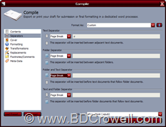 This defaults to Empty Line, Empty Line, Empty Line, and Page Break. Look at your original setup. I want page breaks between each of my scenes, as they’re each a chapter so I set mine to Page Break all the way down. Yours may not be, though. You may have multiple scenes per chapter. If so, pick which works best for you. The good news is, if you don’t go up and change the Format As and save before exiting the compile window, it will remember how you’ve set it for this book so you don’t have to start over again every time you want to recompile.
Cover:
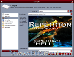
To get your cover art in, you should place it somewhere in Scrivener. I stick mine under Research. Presumably, you could put it elsewhere. Once you select it, it will fill that window and look awful. That’s just a preview thing, though. It still has its original dimensions when you compile it.
Formatting:

Here’s where you can really get in and make things fancy. And where you can get in and screw things up. I have not spent a great deal of time playing with this section, preferring to do my tweaking in Sigil. If you want to see some of the power, you should check out Ed Ditto’s book. In it, he talks about page padding, which you can get to by clicking the Modify button. I do not recommend using page padding within Scrivener. It produces ugly code, which I’ll show when we get to the epub in Sigil.
Transformations:

I mostly just go with the defaults here. Epubs should be able to handle ellipses, italics, and the like. If I was using different colored text, I would have wanted to uncheck the Remove text color box, but I wasn’t. By checking the box, I make sure that no unintended text color changes get introduced into my epub file.
Replacements:
My replacements screen is blank, so I’ll not add a screenshot here. If for whatever reasons you wanted to define words and phrases that should be replaced in the text during compile, you can do that on this screen.Footnotes/Comments:
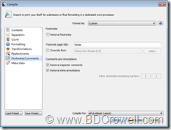 Scrivener lets you insert notes to yourself as comments and annotations. Unless perhaps you were sending this out to an editor, you likely don’t want those in your final epub, so you’ll want to check them. If you were using footnotes in a similar way, you might also want to remove them. I’m not using them, so no need to uncheck the box.
Meta-Data: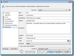
Here, I’m switching to the flash fiction story Pink, since I hadn’t set this up for Repetition. Here’s the behind the scenes details. This is where you can put in the credits: the author, contributors, subject, descriptions, publisher, and rights. This will then get built into the epub file and you’ll be able to see, and later edit if necessary, in the final epub file. This stuff shows up if you import the file into Calibre.Once you have everything set to your liking, you probably want to save your own preset so the next time, you only have to tweak things like the meta-data. When it all looks good, click the Compile button, pick your file name, and you now have a pretty good epub file. But we’re going to use Sigil to make it even better, which we’ll talk about next time. If you have any comments or questions, please leave them below.


0 Comments